728x90
2023-05-30
#2.4 Layout Stream
/**
 * 스크롤 불가 (브라우저가 아니기 때문이다.)
 * 모든 View가 기본적으로 flex Container다
 * react native에서 flex Direction의 기본 값은 column이다.
 * 높이와 너비에 기반해서 디자인 하지 않는다.
 * 다양한 스크린에서 동일하게 작동하도록 반응형의 레이아웃을 사용해야 한다.
 * flex 값을 사용해서 특정 아이콘 및 컨텐츠가 화면에서 차지하는 비율을 지정할 수 있다.
 * 부모 컨테이너에 지정된 flex 값이 자식 컨테이너의 비율 기준이 된다.
 *
 * Layout with Flexbox
 *
 * 컴포넌트는 flexbox 알고리즘을 사용하여 자식의 레이아웃을 지정할 수 있습니다.
 * Flexbox는 다양한 스크린 크기에서 일관된 레이아웃을 제공하도록 설계되었습니다.
 * 일반적으로 레이아웃을 만들기 위해 flexDirection, alignItems 및 justifyContent등을 사용합니다.
 */
컴포넌트는 flex box 알고리즘을 사용한 자식의 레이아웃으로 명시될 수 있다.
flexbox는 각기 다른 화면 크기에 변함없이 일정한 레이아웃을 제공하기 위해 설계되었다.
리액트 네이티브에서 레이아웃을 사용하기 위해서는 Flexbox를 사용해야 한다.
Flexbox는 몇 가지 예외를 제외하고는 웹에서 적용되는 CSS와 거의 같은 방식으로 작동한다고 한다. 아래의 몇 가지 주의사항만을 참고하여 정리하자.
- 웹 에서 FlexDirection의 기본 값은 row이지만, 모바일에서 기본 값은 column이다.
- 웹에서 alignContent의 기본 값은 stretch이지만, 모바일에서는 flex-start이다.
- 웹에서 flexShrink의 기본 값은 1이지만, 모바일에서는 0이다.
Flex
- 내 화면의 중심을 기준으로 가용가능한 공간을 어떻게 채울지를 정의해준다.
- 아이템을 노출할 화면 즉, Main View Container의 자식들의 flex 속성을 기준으로 화면이 분할된다.
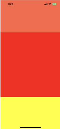
- 아래의 예시를 살펴보자.
- tomato, red, yellow는 flex가 1(default)인 Container View의 자식이다.
- 이 경우 자식의 flex 속성이 부모 Container의 영역에서 채우게 될 영역의 크기다.
- 즉, tomato는 1/4, red는 2/4, yellow는 1/4의 영역을 할당받게 되어 해당 영역을 가용할 수 있다.
import React from "react";
import { View } from 'react-native';

export default function App() {
  return (
      <View style={{flex : 1}}>
        <View style={{flex : 1, backgroundColor : "tomato"}}></View>
        <View style={{flex : 2, backgroundColor : "red"}}></View>
        <View style={{flex : 1, backgroundColor : "yellow"}}></View>
      </View>

  );
}
Flex Direction
flex direction 속성은 특정 노드의 자식들이 배치될 방향을 결정하는 속성이다.
이는 item 배치의 주 축이라고도 불리며, 교차축은 주축에 수직이거나 래핑라인이 배치되는 축이다.
-> 여기서 wrapping이란, 배치할 item들이 가용공간을 넘어설 경우 overflow할지 아니면 wrap(줄바꿈)할 지에 대한 속성을 정의하는 것이다.
- column (default) : 자식을 위에서 아래로 배치한다. 래핑이 활성화 되어 있다면, 다음 줄은 첫 번째 아이템의 오른쪽에 배치된다. (가용공간을 넘어가면 줄바꿈 처리한다는 뜻이다. )
- row : 자식을 좌에서 우로 배치한다. 줄바꿈이 활성화되어 있다면, 다음 줄은 첫 번째 아이템의 바로 아래줄에 배치된다.
- column-reverse : column과 반대 방향
- row-reverse: row와 반대 방향
클릭 이벤트로 Flex Direction 변경하고 결과 확인하기
import React, {useState} from "react";
import { StyleSheet, Text, TouchableOpacity, View } from 'react-native';

const FlexDirectionBasics = () => {
    const [flexDirection, setFlexDirection] = useState('column');

    return (
        <PreviewLayout
            label = "flexDirection"
            values={['column', 'row', 'row-reverse', 'column-reverse']}
            selectedValue={flexDirection}
            setSelectedValue={setFlexDirection}>
            <View style={[styles.box, {backgroundColor:'powderblue'}]} />
            <View style={[styles.box, {backgroundColor: 'skyblue'}]} />
            <View style={[styles.box, {backgroundColor: 'steelblue'}]} />
        </PreviewLayout>
    );
}

const PreviewLayout = ({
    label,
    children,
    values,
    selectedValue,
    setSelectedValue,
    }) => (
        <View style={{padding:10, flex:1}}>
            <Text style={styles.label}>{label}</Text>
            <View style={styles.row}>
                {values.map(value => (
                    <TouchableOpacity
                        key={value}
                        onPress={() => setSelectedValue(value)}
                        style={[styles.button, selectedValue === value && styles.selected]}>
                        <Text
                            style={[styles.buttonLabel, selectedValue === value && styles.selectedLabel]}>
                            {value}
                        </Text>
                    </TouchableOpacity>
                ))}
            </View>
            <View style={[styles.container, {[label]:selectedValue}]}>{children}</View>
        </View>
    );

const styles = StyleSheet.create({
    container: {
        flex: 1,
        marginTop: 8,
        backgroundColor: 'aliceblue',
    },
    box: {
        width: 50,
        height: 50,
    },
    row: {
        flexDirection: 'row',
        flexWrap: 'wrap',
    },
    button: {
        paddingHorizontal: 8,
        paddingVertical: 6,
        borderRadius: 4,
        backgroundColor: 'oldlace',
        alignSelf: 'flex-start',
        marginHorizontal: '1%',
        marginBottom: 6,
        minWidth: '48%',
        textAlign: 'center',
    },
    selected: {
        backgroundColor: 'coral',
        borderWidth: 0,
    },
    buttonLabel: {
        fontSize: 12,
        fontWeight: '500',
        color: 'coral',
    },
    selectedLabel: {
        color: 'white',
    },
    label: {
        textAlign: 'center',
        marginBottom: 10,
        fontSize: 24,
    },
});
export  default FlexDirectionBasics;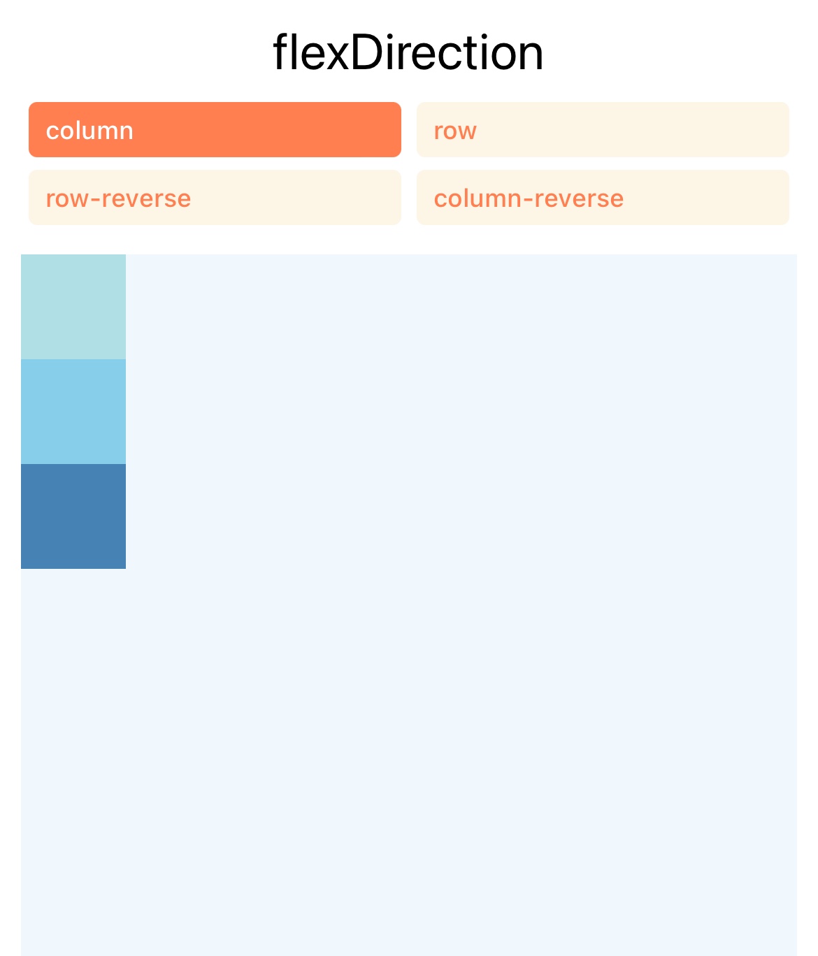
##References
728x90
'FrontEnd > React' 카테고리의 다른 글
| nomadcorders_ReactJS로 영화 웹 서비스 만들기_DAY4 (0) | 2023.05.11 |
|---|---|
| nomadcorders_왕초보를 위한 React Native 101 (0) | 2023.05.10 |
| nomadcorders_ReactJS로 영화 웹 서비스 만들기_DAY3 (0) | 2023.05.09 |
| nomadcorders_ReactJS로 영화 웹 서비스 만들기_DAY2 (0) | 2023.03.24 |
| nomadcorders_ReactJS로 영화 웹 서비스 만들기_DAY1 (0) | 2023.03.22 |